Plotting
This notebook will go over a guide to how plotting works in prysm. We begin by importing some classes which can be plotted, as well as matplotlib. Note that while we use specific prysm clases as examples, virtually every class in prysm can be plotted in the same way.
[1]:
import numpy as np

from prysm import (
    config,
    NollZernike,
    PSF)

from matplotlib import pyplot as plt
plt.style.use('bmh')

plt.rcParams.update({'axes.grid': False, 'mathtext.fontset': 'dejavusans'})
%matplotlib inline
Now we prepare a few prysm objects for plotting. This code is not relevant to the action of plotting and can be ignored for the purposes of this tutorial.
[2]:
zernike_coefs = (np.random.rand(36) * 1 / (0.25 * np.arange(37)[1:]))
zernike_coefs[:3] = 0
zernike_coefs *= 250
p = NollZernike(zernike_coefs)
ps = PSF.from_pupil(p, 5)
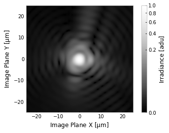
First we will examine the practice of plotting in 2D. This is probably the most common kind of plotting you will do. For a full reference on the plot2d method, please look at the API documentation. The basic invocation works as:
[3]:
ps.plot2d()
[3]:
(<Figure size 432x288 with 2 Axes>,
 <matplotlib.axes._subplots.AxesSubplot at 0x7f77cc64ac50>)
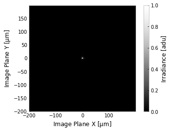
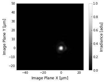
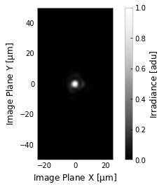
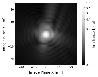
which spans the entire domain by default. PSFs are usually very compact compared to their domain, so we may like to adjust the axis limits:
[4]:
# one axis limit given, ylim will be taken from xlim
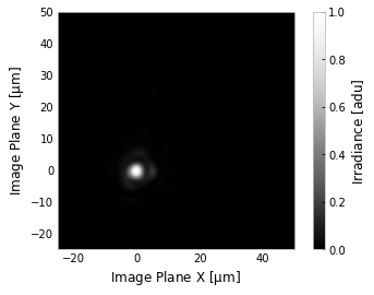
ps.plot2d(xlim=(-25,50))
# or, just give a single number and prysm will duplicate it into symmetric limits for you
ps.plot2d(xlim=25)
# or, give both x and y limits.
ps.plot2d(xlim=(-50,25), ylim=(-25, 50))
# They both can be two numbers, or single numbers
ps.plot2d(xlim=25, ylim=50)
[4]:
(<Figure size 432x288 with 2 Axes>,
 <matplotlib.axes._subplots.AxesSubplot at 0x7f77c8def898>)
Notice at the end that a tuple of (figure, axis) references are returned by the plot2d function. These refer to the figure and axis on which the graphics were drawn.
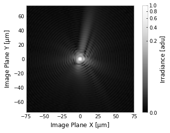
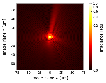
The xlim/ylim parameters give a lot of flexibility to adjusting axis limits, which details with teh PSF being compact in x and y. However, it is also very high dynamic range in z. For this, we have two built-in options - plotting on a power or log scale:
[5]:
# stretch to the 1/4 power, this is an extreme stretch by the standards of many in astronomy
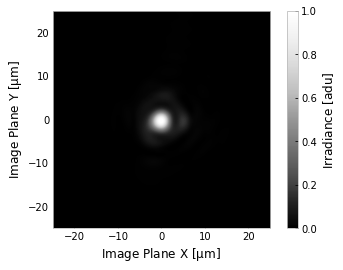
ps.plot2d(xlim=75, power=1/4)
# use a log scale spanning 6 decades, and a better interpolation scheem for such high dynamic range
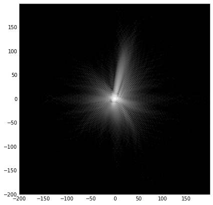
ps.plot2d(log=True, clim=(1e-6,1), xlim=200, interpolation='bilinear')
[5]:
(<Figure size 432x288 with 2 Axes>,
 <matplotlib.axes._subplots.AxesSubplot at 0x7f77c8d6d470>)
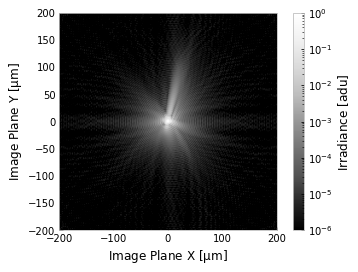
In this second case we have adjusted the interpolation method to better suit the graphic. This can be done globally with the config object:
[6]:
# the default is lanczos interpolation, which gives a great visual smoothness,
# but occasionally suffers from its own complexity
ps.plot2d(xlim=25, power=1/3)

# now the default is globally changed for any plotting
config.interpolation = None
ps.plot2d(xlim=25, power=1/3)

# but of course we can use whatever we want on a case-by-case basis
ps.plot2d(xlim=25, power=1/3, interpolation='bilinear')
[6]:
(<Figure size 432x288 with 2 Axes>,
 <matplotlib.axes._subplots.AxesSubplot at 0x7f77c8395f28>)

The colormap can also be changed to any map supported by matplotlib:
[7]:
ps.plot2d(xlim=75, power=1/4, cmap='hot') # hot is pretty popular for visualizing PSFs of IR systems
[7]:
(<Figure size 432x288 with 2 Axes>,
 <matplotlib.axes._subplots.AxesSubplot at 0x7f77c8c1cda0>)
Last, but not least, the labels and colorbar can be turned off, and figure and axis passed into plot2d to draw the graphic on whatever canvas you want (e.g., as part of a grid of subplots, or on a larger figure…)
[8]:
fig, ax = plt.subplots(figsize=(7,7))
ps.plot2d(fig=fig, ax=ax, show_colorbar=False, show_axlabels=False,
          clim=(3e-6,1e0), log=True, interpolation='bilinear')
[8]:
(<Figure size 504x504 with 1 Axes>,
 <matplotlib.axes._subplots.AxesSubplot at 0x7f77c82aedd8>)